Twelve Houses Studio
Astrology as artifact.
A contemporary lifestyle brand built around the cultural language of astrology — moving beyond literal star-sign imagery to explore archetype, history, material culture, fashion, and symbolic meaning.
The world extends across product design, art direction, photography, editorial content, packaging, campaign concepts, and an evolving visual language grounded in objects, places, color, and cultural reference.

Oxblood, parchment, and the talisman.
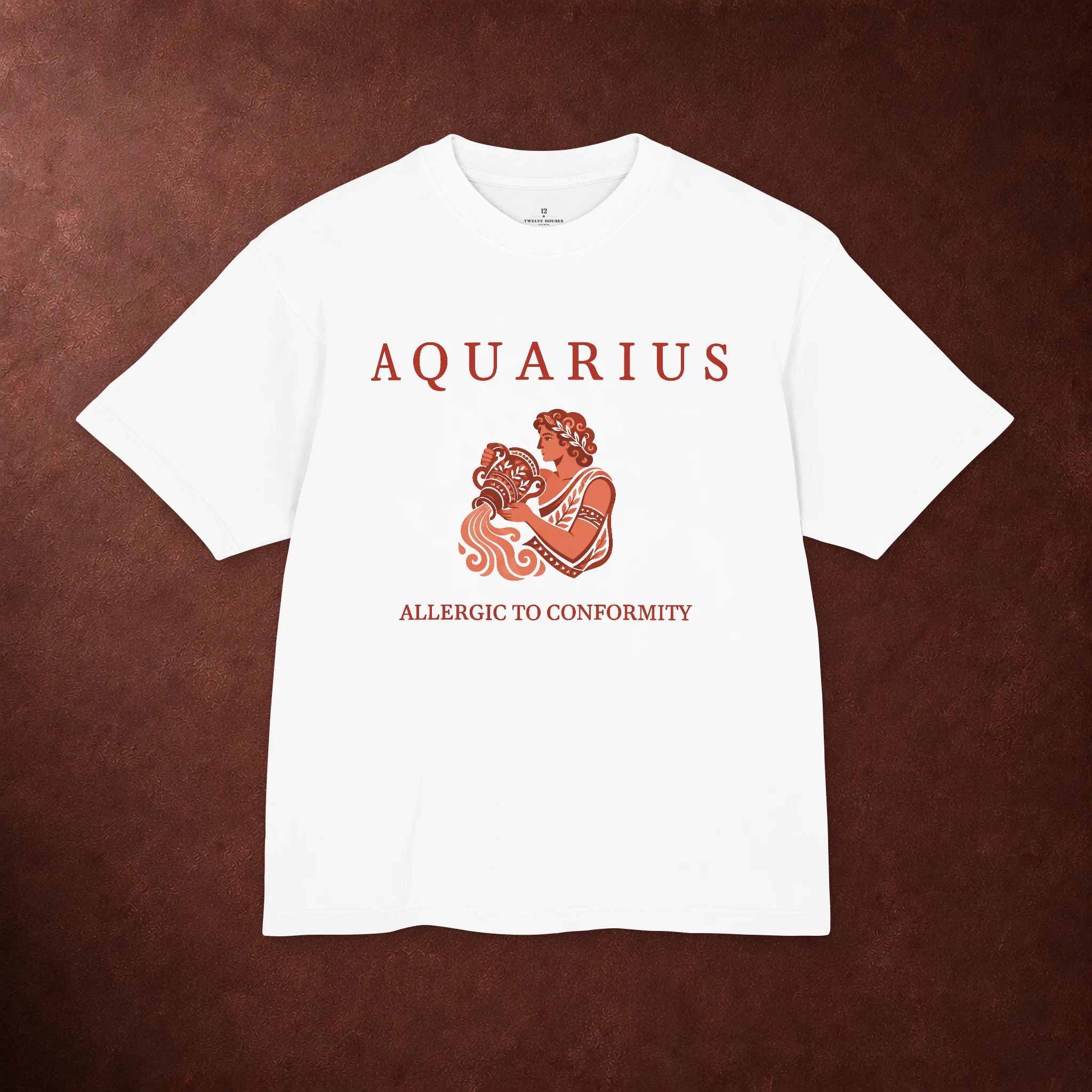
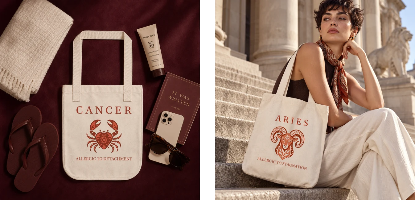
The brand needed to feel less like zodiac merchandise and more like something collected. Oxblood became the grounding color: deep, tactile, and closer in spirit to leather, book cloth, lacquer, and old interiors than to the bright palettes often associated with astrology.
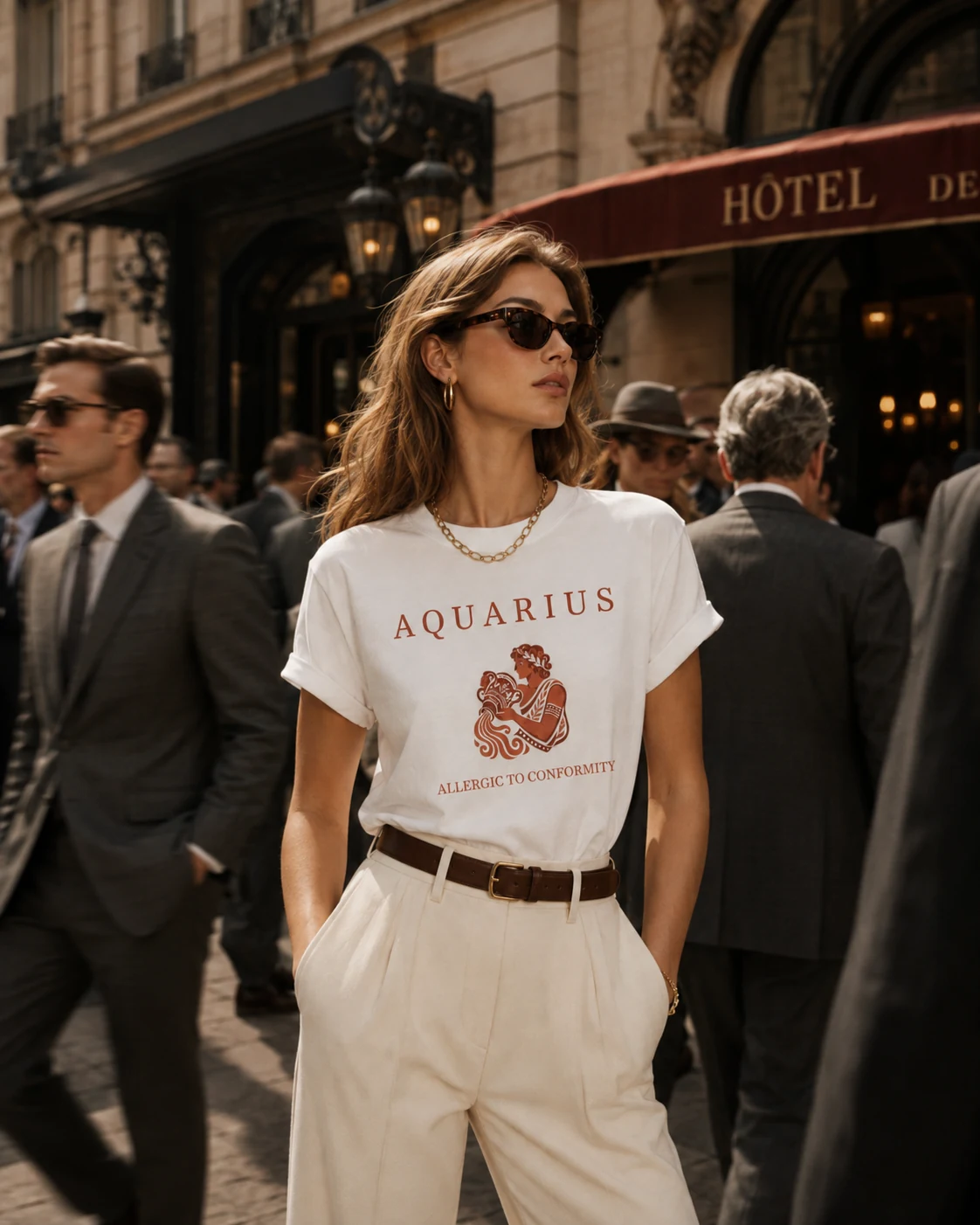
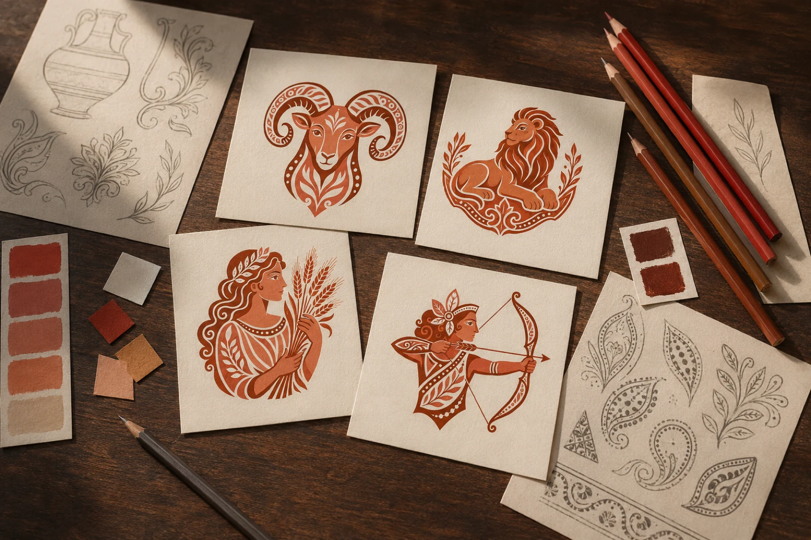
Against it, cream cotton and terracotta illustration feel more considered. Each sign is framed as an emblem rather than a novelty graphic — something chosen for its archetypal charge, not simply because it matches a birth date. The product begins to read as artifact, almost as talisman.
The product is only one entry point.
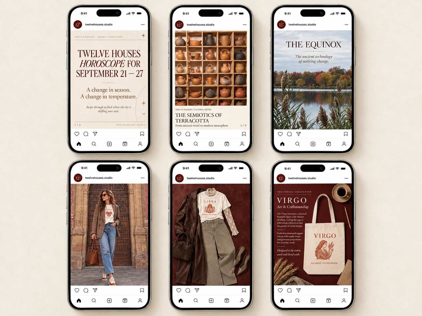
Twelve Houses was designed to behave more like a small cultural publication than a product feed. Horoscopes sit beside material culture, semiotics, seasonal ritual, art, museums, travel, fashion, and symbolic history.
Campaign photography, flat lays, cultural notes, and astrology all share the same visual and verbal language, so each piece of content adds another room to the same world. The product lives inside that universe rather than interrupting it.
Symbol, object, image, story.
Twelve Houses was designed as a system that can move across mediums without losing its point of view — from apparel and objects to campaign imagery, cultural storytelling, and editorial content.
Visit Twelve Houses Studio ↗